
The back story
In my earlier post, I had written about how I built a travel app in a couple of hours using Sabre and LumX. At the end of that post I wrote that I wasn't very happy with the UI. LumX had looked good as a UI framework, but I wasn't able to get productivewith it: there weren't enough examples, and the documentation wasn't great.
At the same time, I was intrigued by this material design thing... Were there other options out there? Could I improve the UI for the Travel App quickly? Let's find out...
What is Material Design, anyway?
Google says:
Material design is a comprehensive guide for visual, motion, and interaction design across platforms and devices.
Wikipedia is clearer and more useful!
Material design (codenamed quantum paper) is a design language developed by Google and announced at the Google I/O conference on June 25, 2014. Expanding upon the "card" motifs first seen in Google Now, it is a design with increased use of grid-based layouts, responsive animations and transitions, padding, and depth effects such as lighting and shadows.
So, basically, it is a design language from Google that works across device form factors, that combines simple elements like lists & cards with animations, lighting and shadow to produce beautiful UI. As always, a picture is worth a thousand words:
Can I do Material Design with AngularJS?
This is what I wanted to do - explore this Material Design thing with AngularJS. I searched, and found a few good "list of UI frameworks for Material Design" (here,here and here) kind of articles that gave me pointers to my options, which I narrowed down to be:
- LumX: I had already tried it, and wasn't happy with it
- Bootstrap Paper: Didn't look the best, and not really AngularJS - built on Bootstrap.
- Polymer Project: Seemed too cutting edge, and yet, not much action was happening around it. Wasn't sure if I could use it with AngularJS.
- Ionic Material: Looked beautiful & really interesting: maybe for my next post when I'm doing a mobile app?!
- And finally... Angular Material: the perfect fit, looked good, worked for the web, pure AngularJS and great documentation!
Playing with Angular Material
Whenever I'm exploring something new, I play around with it for a while - looking at demos and documentation - before taking the plunge and getting my hands dirty with it. It's like dating the framework before making the committment :)
So, as always, I played around with the demos on the Angular Material site to get a feel of things.
The demos were cool - especially Grid List and Bottom Sheet! I especially liked that I could open up the source right there for each of the demos, or look at the source on CodePen. Looking through the source, it seemed like this would be easy to use, since there were powerful directives doing the work behind the scenes for the interaction and animations.
I then looked at the section on layout, to understand how layouting worked in Angular Material. This had been a source of grief for me with LumX, and I was pleased to see that the documentation and examples on Layout were much better for Angular Material.
I was sold by now, and it was time to get my hands dirty...
Getting my hands dirty
I decided that I would improve on the code for the travel website I had done in thelast post. First things first, I had to install Angular Material:
$ cd ~/Lab/sabrelab/www
$ bower install angular-material
This installed Angular Material, so I could get started coding. I also uninstalled LumX (bower uninstall lumx) which I had used previously in the same project. (Note: You don't need to know about the earlier code to read the code coming up).
The requirements
I then thought through the structure of the code, and what I wanted:
- A toolbar on top
- A origin city text field
- A set of fields to capture the budget, and dates.
- Errors displayed nicely
- A list of results on success
In addition, I was keen to:
- Use auto-fill & search for the text field of cities
- Try toast notifications for the errors
- Have tooltips to describe what needed to be done
The code
Given these requirements, this is how the index.html file came out:
Boilerplate stuff to include the CSS
<!DOCTYPE html>
<html lang="en">

<head>
  <meta charset="UTF-8">
  <title>Get Lost</title>
  <link rel="stylesheet" href="./bower_components/angular-material/angular-material.css">
</head>

<body ng-app="getLostApp" ng-cloak>
  <md-content>
The toolbar on top
    <!-- The top toolbar -->
    <md-toolbar>
      <div class="md-toolbar-tools">
        <md-button class="md-icon-button" aria-label="Settings">
          <md-icon md-svg-icon="./bower_components/material-design-icons/maps/svg/design/ic_local_airport_24px.svg"></md-icon>
        </md-button>
        <h2>
          <span class="md-title">Get Lost!</span>
        </h2>
      </div>
    </md-toolbar>
This was interesting only in terms of including the Airport SVC icon on the top left. I found that Google has released a set of Material Design Icons in SVG format. This can be easily installed from the command line using:
$ bower install material-design-icons
The only catch with this is that the installation is 57 MB of icons!
The next step was the Origin city text field, with autocomplete & tooltip:
<!-- The content area -->
    <div layout="row">
      <!-- 20% padding to the left -->
      <div flex="20"></div>

      <!-- The main action happens here -->
      <md-card flex ng-controller="MainCtrl as ctrl">
        <md-card-content>
          <!-- The row for the city select autocomplete list -->
          <md-content>
          <md-autocomplete  md-selected-item="ctrl.selectedItem"
            md-search-text="ctrl.searchText"
            md-items="item in ctrl.querySearch(ctrl.searchText)"
            md-item-text="item.display"
            md-min-length="0"
            placeholder="Where are you flying from?">
            <md-item-template>
              <span md-highlight-text="ctrl.searchText" md-highlight-flags="^i">{{item.display}}</span>
            </md-item-template>
            <md-not-found>
              No matches found for "{{ctrl.searchText}}".
            </md-not-found>
          </md-autocomplete>
          <md-tooltip>
              Pick the city you want to start from!
          </md-tooltip>
          <p class="md-caption">NYC, CHI and LON work well</p>
This was a little complicated, and it requires corresponding code in the JavaScript app.js (further below), but with careful reading of the documentation & code you should be able to figure it out.
The next was fields to pick up the budget & the dates, and the submit button, the directive for date input is styled nicely:
</md-content>
          <!-- The row for the budget and dates -->
          <div layout>
            <md-input-container flex>
              <md-select placeholder="Set your budget" ng-model="info.maxfare">
                <div ng-repeat="p in prices">
                  <md-option value="{{p.value}}">{{p.show}}</md-option>
                </div>
              </md-select>
            </md-input-container>
            <md-input-container flex>
              <label>Start date</label>
              <input type="date" ng-model="info.departuredate">
            </md-input-container>
            <md-input-container flex>
              <label>End date</label>
              <input type="date" ng-model="info.returndate">
            </md-input-container>
          </div>

          <!-- The submit button -->
          <div layout>
            <md-button class="md-raised md-primary" ng-click="submit()">Search for destinations!</md-button>
          </div>
And then the last bit, displaying the results:
  <!-- The results -->
          <md-content ng-show="fareinfo">
            <md-list>
              <md-subheader class="md-no-sticky">Results</md-subheader>
              <md-list-item class="md-3-line" ng-repeat="item in fareinfo | orderBy:'LowestFare'">
                <div class="md-list-item-text">
                  <h3>Destination: {{ item.DestinationLocation }}</h3>
                  <h4>Lowest fare: $ {{ item.LowestFare }}</h4>
                  <p>Lowest non-stop fare: $ {{ item.LowestNonStopFare }}</p>
                </div>
                <md-divider></md-divider>
              </md-list-item>
            </md-list>
          </md-content>
        </md-card-content>
      </md-card>

      <!-- 20% padding to the right -->
      <div flex="20"></div>
    </div>
  </md-content>
  <script src="./bower_components/angular/angular.js"></script>
  <script src="./bower_components/angular-aria/angular-aria.js"></script>
  <script src="./bower_components/angular-animate/angular-animate.js"></script>
  <script src="./bower_components/angular-material/angular-material.js"></script>

  <script src="./app.js"></script>
</body>

</html>
The app.js JavaScript file is on GitHub, the key functions to look through are the ones for the auto-fill logic and for showing the toast message.
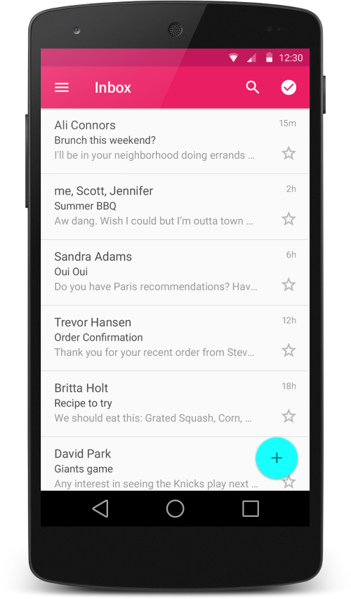
How does it look when done?
MUCH BETTER than the earlier version! It was actually working well and feeling like a professional designed service - just with a mornings work! This included toast messages, auto-filling data and other things that would have taken me hours!
You should try it out yourself on: http://52.10.111.167.
Closing thoughts
I really, really liked Angular-Material, it made me super productive in a day and I was able to whip out beautiful, professional, interactive UI!
My top 5 thoughts about Angular Material:
- Easy & fast to get started
- Great documentation
- Works well across browsers (tried Chrome, FF and Safari)
- Has most things I need to build UI
- Only wish: it had a file-upload directive
That's it - hope you enjoyed the article, and look forward to your comments! @appa


